
Microsoft Excel allows you to create tables in the sheet to organize data. The table with numerous columns and rows can be recalculated, filtered, sorted, reformatted, and updated with new details. If you are willing to know how to make a table in Excel 2010 or in other versions of Excel then read this guide to get enlightened.
If you are a regular user of Microsoft Excel then you must know that Excel allows you to make different kinds of tables. But if you are a beginner or want to expand your knowledge about using Excel then you can learn here to create various types of tables in Excel.
In Microsoft Excel, you can create a basic table, pivot table, frequency table, data table, comparison table or create graphs from the table. Therefore, in this particular guide, you will discover the following types of tables and create them using easy formulas or tools.
- How to Make a Table in Excel 2010 or Other Versions?
- How to Make a Pivot Table in Excel 2016 or Other Versions?
- How to Make a Frequency Table in Excel?
- How to Make a Data Table in Excel 2010 or Other Versions?
- In Excel, How to Make a Graph from a Table?
- How to Make a Comparison Table in Excel?
How to Make a Table in Excel 2010 or Other Versions?
If you want to learn how to make a table in Excel 2010 or 2016 then you can go through the steps instructed below.
- In the Excel sheet, you need to select a cell in the data set.
- Then, you can go to the Insert tab on the top.
- Under the Tables group, you are required to click on the Table. As an alternate option, you can use Ctrl + T keys on your Keyboard.
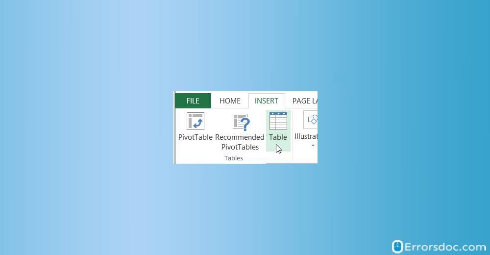
- Thereafter, a dialog box for Create Table appears on your screen with the data selected. Here, you can modify the range if it is required. And if you want the very first row to be the table headers then you need to make sure that you select the My table headers option.
- Once done with the setting preferences, you can click on the OK button.
Later, Excel converts the range of your data in a true table. However, the design of the table is basic which is set by default. Luckily, Excel provides many features using which you can change the style and name of the table or add sort or filter options to the table. If you were looking for easy ways on how to make a table in Excel 2010 or other versions with a specific style, the above-mentioned steps are useful and easy to apply.
How to Make a Pivot Table in Excel 2016 or Other Versions?
A pivot table is the most useful way to analyze or summarize your data in a spreadsheet. If somebody asks how do you make a pivot table in Excel 2016 or other versions then you can let them walk through the following steps down below.
- To get started, open the Excel sheet with large data.
- Now, you need to highlight the cell where you want to make the pivot table. (For example Sheet 2 and Cell A1).
- After this, you can go to select the Insert tab from the top menu bar.
- Under the Table group, you can select the Tables button.
- Then, you can choose PivotTable from the menu.
- Once done, you will see a Create Pivot Table window appears on your screen.
- At this point, you can select the range of data and hit the OK button.
- When your PivotTable appears, you can select the fields to the report.
- Next to this, in the Values sections, you can click on the option Sum of Order ID and then drag it to the Rows area.
- If you want to show the Order IDs in Cell A1 then you can type Order ID in the Cell A1.
Eventually, you will see the total quantity for Order ID in your Pivot table. So if you had a question on how to make a Pivot table in Excel 2016 and 2010, the above-mentioned steps are simple to implement in the Excel sheet.
How to Make a Frequency Table in Excel?
By creating a frequency table, you can tabulate the times’ values from the data set that appear within a certain range. If you want to learn how to make a frequency table in Excel, look for the steps mentioned down below.
- In the Microsoft Excel sheet, enter your data in Column A. (For example: type the Employee scores in the Cell A1 through A50).
- Now, in Column B, enter the record of bin values. These values match to a non-overlapping numerical range. Also, it should be arranged in ascending order.
- Then, you can type the following formula in cell C1.
- =Frequency(data_range,bin_range)
- After that, you need to replace “bin_range” and “data_range” with the actual bin values and data range.
- Once done, you can hold the Shift key on your keyboard.
- Then in Column C, click the last cell that tally the last bin value in Column B. (For example: hold the Shift key and click Cell C5 in order to select from C1 to C5).
- Thereafter, you can use the F2 key and press Ctrl + Shift + Enter. This will copy the formula.
- Column C starts displaying the frequency distribution of your data set.
- As the last step, you can go to the Insert tab and select the Insert Column Chart option under the Charts group.
- Here, you can select the first option available in 2 D or 3 D Column in order to design a frequency chart.
How to Make a Data Table in Excel 2010 or Other Versions?
Instead of building different scenarios, it is better to create a data table and check different values for the formula. To make it easy, you can create a One Variable Data table and Two-Variable Table. To know more about how to make a data table in Excel 2010 or 2016, you can carefully check out the steps mentioned below.
One Variable Data Table
- In Excel, you can select the cell B12 and then start typing =D10. This refers to the total number of profits.
- Next to this, you can type some other percentages in A Column.
- After this, you can choose the range A12: B17.
- After calculating the whole profit, you can go to the Data tab.
- Then, under the Forecast group, you can click on the What-if Analysis option.
- Here, you can click on the Data Table.
- In the Data Table, put the cursor in the Column input cell and choose the cell C4 (because the percentage refers to cell C4).
- Once done, click on the OK button in order to apply your actions.
Note: Since the formula bar shows the cells containing array formulas so you cannot remove a single result. You need to select the B13: B17 range and hit the Delete key.
Two Variable Data Table
- In the Excel sheet, select the A12 cell and start typing =D10 as it refers to the total profit.
- Then, you can type other unit profits which should be the highest price in row 12.
- Next to this, in Column A, enter a different percentage.
- Now, you need to choose the range A12: D17.
- After the calculation, you can navigate through the Data tab.
- Under the Forecast group, you can click on the What-If Analysis option.
- Here, you can select the Data Table.
- This time, you have to put your mouse cursor in the Row input cell as the unit profits available in a row and then select the D7 cell.
- After that, in the Column input cell as the percentages are available in a column and then select C4 cell.
- As the last step, you can click on the OK button to see the result.
If you were in the quest of how to make a table from Excel data or create a data table, the above-mentioned are helpful to follow.
In Excel, How to Make a Graph From a Table?
To create a graph or chart in Excel, first, you need to enter the data in the sheet. If you want to learn that in Excel, how to make a graph from a table, go through the following steps, and implement these ideas.
- To begin, open the blank Excel sheet.
- Then, you need to review the type of graph you wish to create because there are three types of graphs based on different kinds of data. Here are the following graphs.
- Bar: It displays more than one set of data with vertical bars. The bar graph is good for mentioning the differences in the data or comparing two sets of data together.
- Line: It displays more than one set of data with Horizontal lines. Line graphs are suitable for displaying growth or fall in the data.
- Pie: It displays more than one set of data as a fraction which is best for displaying the visual distribution of the data.
- Now, you can add the graph headers that you can create from while leaving the A1 blank.
- Then, you can add the graph labels that start with column A2.
- Once done, enter the data for the graph in B2.
- Now you have added the information so you can insert the data file.
- Before that, you need to click and drag the mouse from going left to right. Make sure that you select the labels and headers as well.
- After that, you can click on the Insert option located on the top.
- Here you can select the type of graph you want to create. With the help of the drop-down, you can choose the Bar, Line, or Pie graph.
- Besides that, you can select the format such as 2D and 3D. You can also hover the mouse over the format for the preview.
- Now, you can add the title for your graph. For that, you can double click on the Chart Title and add a custom name. If you are a Mac user, then click on the Design tab, go to Add Chart Element, choose Chart Title, click on the location and type the title for the graph.
- As the last step, you can save the document by going to the File. Then, double click on This PC, go to the save location located on the left, enter the name of the document into the File name and click on Save
How to Make a Comparison Table in Excel?
By comparing the table, you can easily analyze the set of data. If you want to learn how to make a comparison table in Excel then you can look for the following steps instructed below.
Comparison of two Columns
- First of all, you need to highlight the cells. If it requires comparing A2 and B2 then highlight the C2 column.
- Now, you can enter the comparison formula =IF(A2=B2,”Match”,”No match”) for the first row.
- You can click twice the Fill box as this will add the formula to the remaining cells.
- Now look for the Match and No match results which appear on the right. This will help you to understand if the data is matched or not.
Conclusion
By creating tables in Excel, you can examine the set of data easily. Whether you want to compare the table or create graphs from the table, you can do it just by building a table that is suitable for certain tasks. To create tables, you either can use formulas or go through the tools provided by Microsoft Excel.
You can also create a pivot table, frequency table, and data table in Excel. So if you are thinking how can I make a Pivot table in Excel 2007 or how to make a table of contents in Excel, this guide would have walked you through all the techniques you can apply in your Excel sheet.
Besides that, If you want to learn how to create collapsible rows in Excel, we have reviewed an article for that. Also, learn to add a subtract function in Excel to calculate a large sum.